
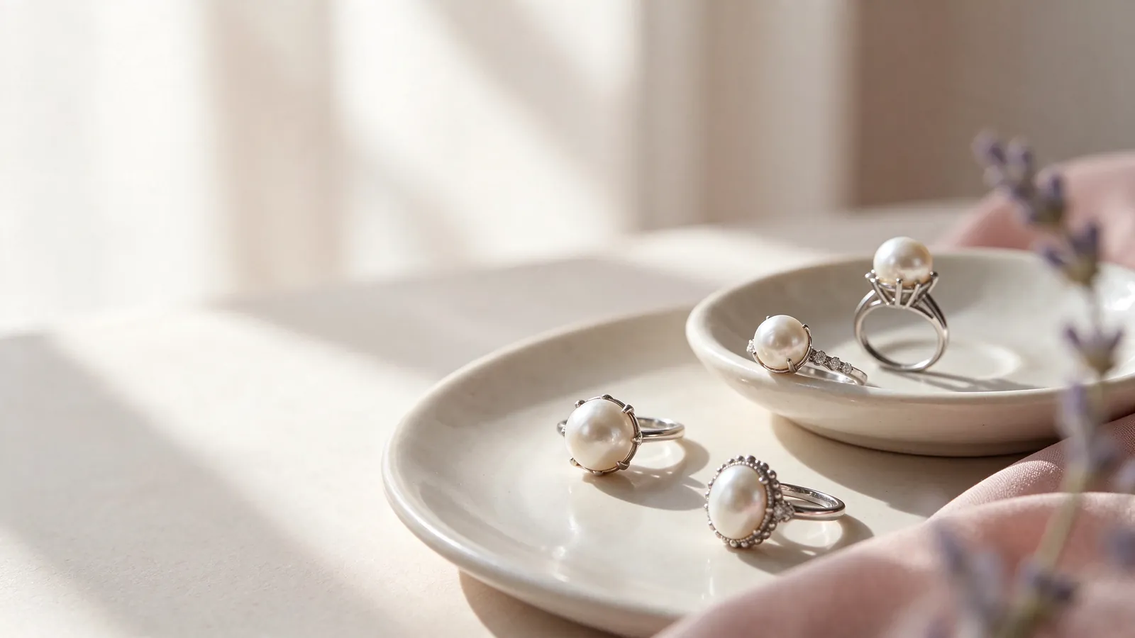
How would you pair an 18K gold pearl ring with everyday jewellery: a white gold pearl ring or a rose gold pearl ring?
Lay out the watch, earrings and rings that you reach for during an ordinary working week. That small group is a more useful starting point than a photograph styled for a special occasion. A white gold pearl ring can continue a predominantly white-metal look, while a rose gold pearl ring can introduce a warm detail against a white shirt or grey knitwear. Neither direction belongs to a particular skin tone. The question is whether you want the ring to blend with familiar pieces or become a deliberate contrast.
Compare the whole hand rather than the ring in isolation. Place it near the sleeve and watch you normally wear, and notice which feature attracts your attention first. If the watch already has a strong presence, a cleaner band outline may leave more space for the pearl. The single pearl ring guide can help you consider a pearl-led focal point, then relate the band to your existing jewellery instead of competing with every item at once.
For an 18K gold pearl ring, how do band width and fit shape the look and feel of a white gold pearl ring or a rose gold pearl ring?
A broader band gives the metal more visual presence; a finer line may direct more attention towards the pearl and its setting. Width also changes how a ring feels, so a familiar size number is not enough to predict comfort. Straighten your fingers, make a relaxed fist and notice pressure against neighbouring fingers. Watch whether the setting repeatedly turns towards the palm. Making the ring tighter is not necessarily the right answer to an unsuitable balance or band shape.
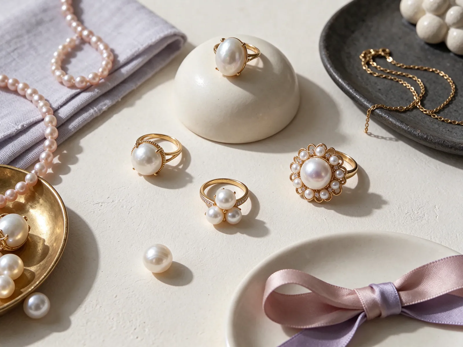
Separate white gold from platinum before comparing designs
The name of a white metal matters. Here, 18K 750 white gold means white gold, not platinum; PT950 and PT900 are separately identified platinum options. A pale appearance in a photograph cannot tell you which material is being shown. Read the full metal description rather than treating every white setting as interchangeable. If your decision is between white gold and platinum, the platinum pearl ring guide offers a separate comparison, allowing you to distinguish a material preference from a preference for a particular silhouette.
For styling, consider how a white band connects with nearby white-metal pieces and how much detail surrounds the pearl. An uncluttered setting may suit a strong watch or a patterned sleeve, while a more visible band can become part of the focal point. Lighting changes the apparent brightness of metal, especially against dark photographic backgrounds. Compare under conditions close to your daily routine rather than assuming that the brightest studio image represents a fixed appearance.
Describe the material and the outline as separate preferences
A useful description might be '18K 750 white gold, a clean band and a pearl-led design'. Then add whether you prefer the setting close to the finger and whether another ring will sit beside it. Simply asking for a white pearl ring leaves the metal and pearl colour unresolved. A reference photograph can communicate a curve or a proportion without requiring every visible feature to be copied into one design.
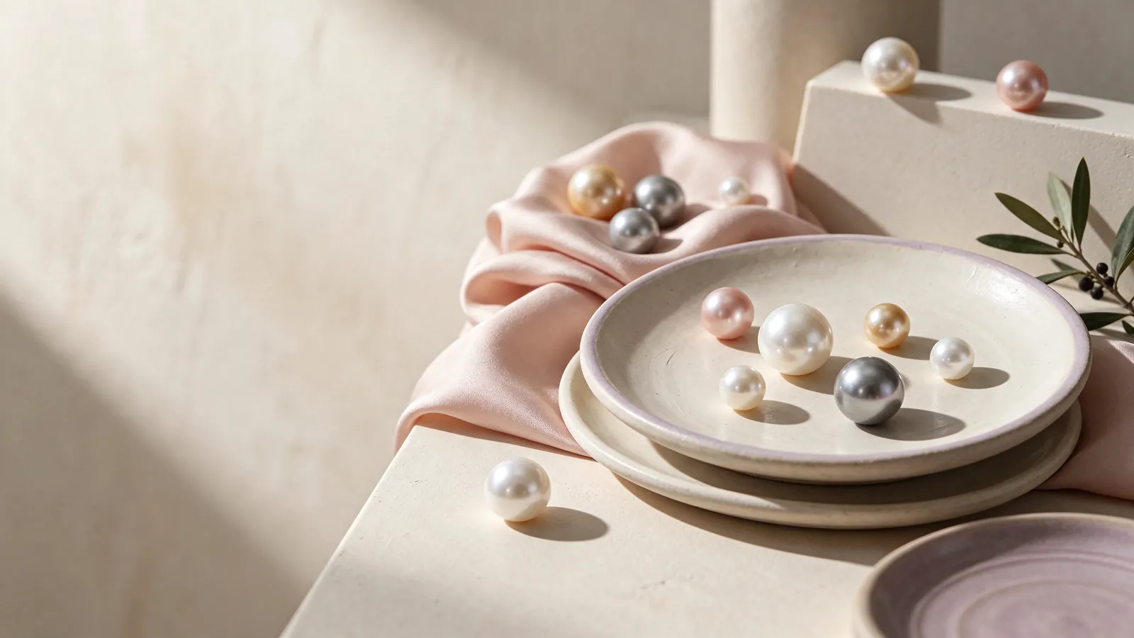
Use yellow or rose gold as a warm styling choice, not a pearl label
18K 750 yellow gold can echo a warm-coloured watch or create a distinct accent beside cream and navy clothing. 18K 750 rose gold offers another warm direction that you may prefer with neutral outfits. Start by deciding whether warmth should dominate or appear only in the ring. Keep the pearl, background and lighting as comparable as possible when considering metal colours; otherwise, differences between photographs can easily be mistaken for differences caused by the setting.
Rose gold describes the metal, not the pearl. It neither requires a pink pearl nor identifies a pearl variety. If it is the pearl's own pink or lavender appearance that interests you, the pink freshwater pearl ring guide addresses that separate question. Look at the pearl independently before considering the combination. This helps distinguish a genuine colour preference from the warm impression created by a rose-coloured band, nearby fabric or photographic background.
Compare the combination in the light you will actually use
Look in daylight and under the indoor lighting typical of your home or workplace. The goal is not an identical appearance everywhere, but a combination you enjoy in those familiar settings. First observe the pearl against a neutral background, then bring the chosen metal and sleeve into view. Do not treat a warm photograph as evidence of a particular pearl overtone, and avoid making a final choice from one strongly coloured image alone.
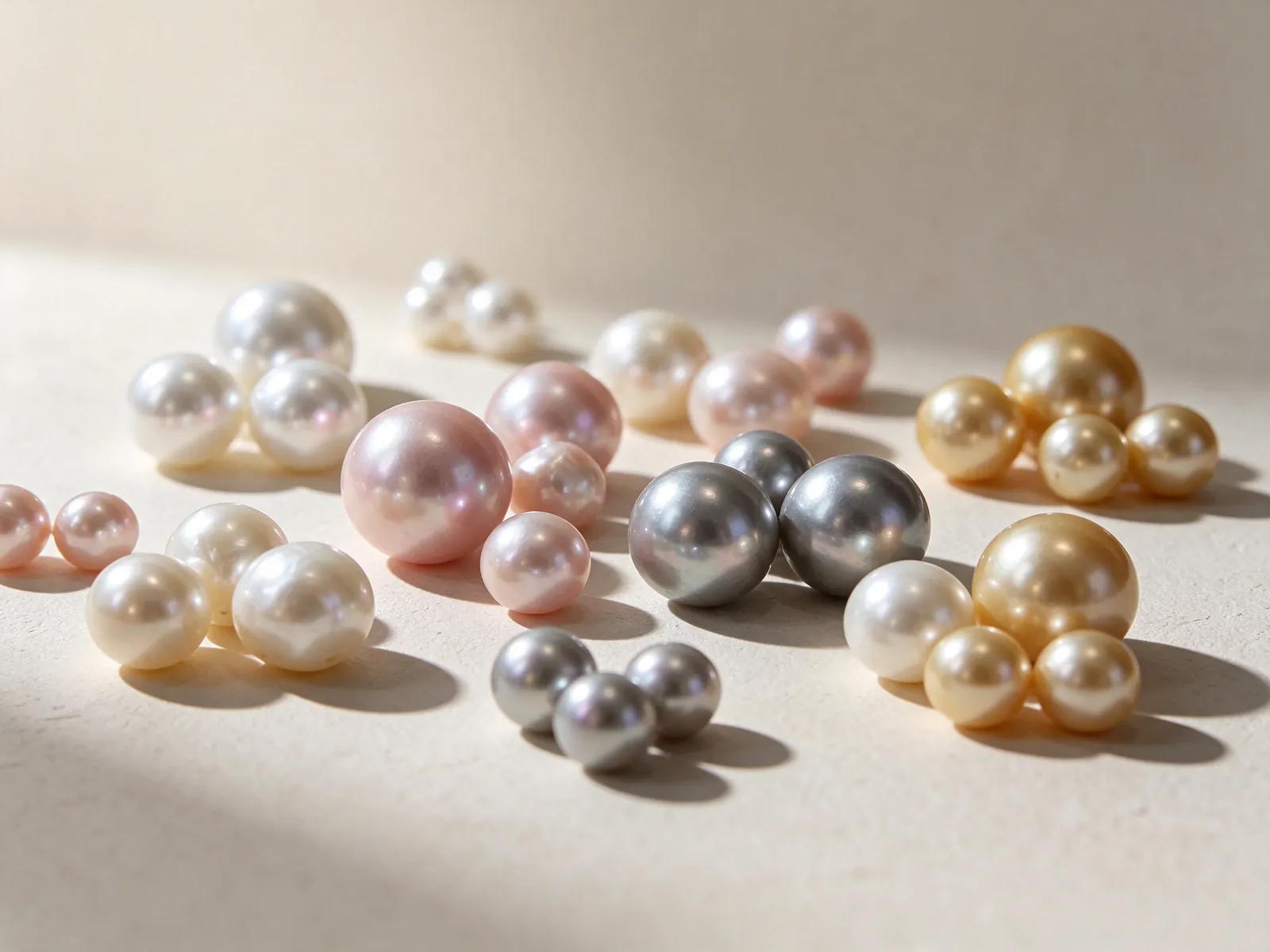
Give the pearl as much attention as the colour of the band
GIA describes seven pearl quality factors: size, shape, colour, lustre, surface quality, nacre quality and matching for jewellery with more than one pearl. This framework gives you better questions than simply asking which setting looks more expensive. Consider whether the lustre appeals to you, whether the outline complements the band, and how the visible surface and overall proportions work together. The framework explains pearl assessment; it does not mean that a particular ring or pearl has a GIA certificate or a named grade.
Pearl colour is also more nuanced than one colour word. Bodycolour, overtone and orient are distinct components, and not every pearl has all three. When a warm band changes your impression of the combination, separate that effect from the pearl's own appearance. Shape and colour alone cannot establish origin or natural-versus-cultured identity. If those details matter to your choice, read the description or relevant documentation for the individual pearl rather than drawing conclusions from a styling image.
Look at the side profile as well as the view from above
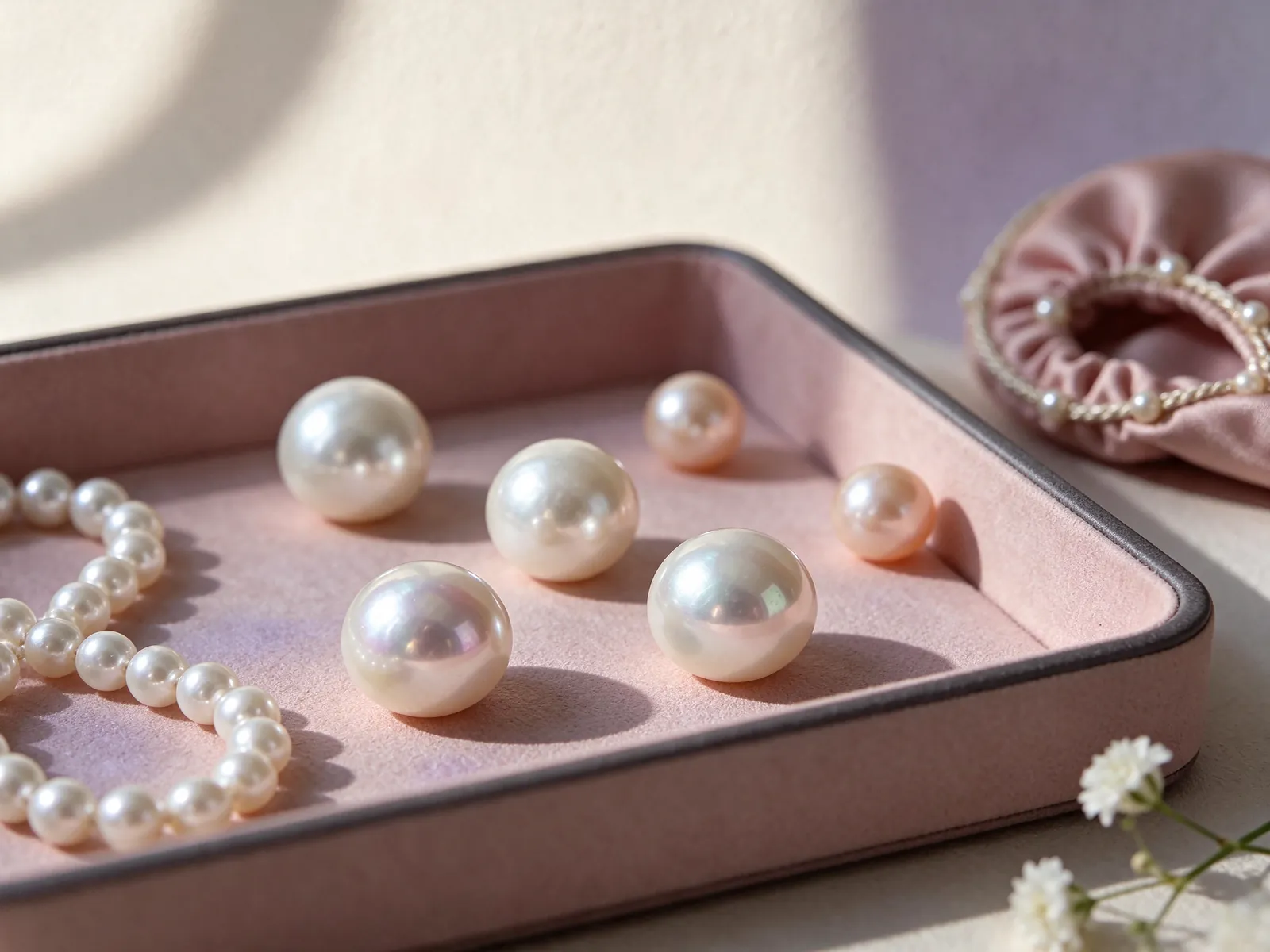
The area a pearl occupies across the finger is only part of its presence. The height and outline of the setting affect how the ring sits beside sleeves and other rings. If a broad pearl-led look appeals to you, the mabé pearl ring guide is a related design topic to explore. A photograph that appears shallow is not enough to identify pearl type, diameter or the height of a finished setting.
Check the knuckle, the base of the finger and the ring's balance
A ring must pass the knuckle and then sit appropriately at the base of the finger. If it feels loose at the base, reducing the size without considering the knuckle may make removal difficult. The guide on how to measure ring size helps you prepare useful measurements, but a strip of paper cannot reproduce every band width or inner profile. Record the intended finger and the measurement method so the information has context.
During a fitting, let the hand relax and then use natural movements, noticing whether the setting rotates or presses against adjacent fingers. Finger conditions can vary with activity and time of day, so a single measurement need not capture every wearing situation. If stacking is part of your plan, assess both rings together: the space occupied by neighbouring bands differs from wearing one alone. Comfort is not the same as maximum tightness, and easy movement is not automatically a good fit.
Keep the original sizing system when discussing an overseas ring
A Japanese size number and a US size number should not be treated as the same measurement. Japanese to US ring size conversion is a useful starting point for understanding the systems. Keep the original number and system, along with any known internal diameter or circumference. Conversion does not account for band width or the balance of the pearl setting. When using an existing ring as a reference, explain where you wear it and whether it already feels loose or tight.
Plan outfits and stacking around contact points, not colour alone
For office wear, start with the cuff and the movements your day involves. A structured shirt sleeve can meet a raised setting differently from loose knitwear, where exposed details may catch. A white band may echo cooler clothing, while yellow or rose gold can provide a warm focus within neutral outfits. Those visual relationships are useful, but they do not tell you whether a particular outline will suit repeated hand movements or close-fitting sleeves.
For a dinner or gathering, you can let the pearl ring lead without matching every accessory to the pearl. Repeat the metal colour in earrings or a watch and keep other details quieter, or mix white and warm metals with one colour remaining dominant. If several pieces compete for attention, remove one before adding more. A successful combination is one you can repeat with clothes you own, rather than an arrangement that only works in a carefully composed photograph.
Check where a neighbouring ring meets the setting
Before stacking, look from the side to see whether the second band touches the pearl or pushes against the setting. Try natural hand movements rather than pressing the rings together to create a tightly packed look. Wearing them on separate fingers can retain the colour relationship without forcing contact. If the other ring has an elaborate outline, a cleaner pearl band may leave enough visual and physical space for both pieces.
Care for the pearl and prepare a clear design conversation
A pearl ring needs care appropriate to the pearl, not just the gold. GIA places pearl at 2.5 on the Mohs hardness scale and says pearls should never be cleaned with ultrasonic or steam cleaners. After wearing, use a very soft, clean cloth. Avoid contact with acids, perfume, hair spray and excessive heat. A cleaning method intended for metal jewellery is not automatically suitable for a ring containing a pearl.
Remove the ring before handling cleaning products, gardening or activities likely to knock the setting, and put it in a consistent safe place. Keep the pearl from rubbing against other hard objects in storage rather than dropping the ring into a bag with keys. If the setting appears loose or the fit changes unexpectedly, stop wearing it and arrange an inspection. Repeatedly twisting or pulling the pearl is not a useful way to test its security.
Bring preferences that explain how you want to wear the ring
For a conversation with Flint Jewellery, gather photographs of your usual accessories, the intended finger, any existing sizing information and the activities that influence your choice. Describe the metal colour you prefer, the band outline you like and the contact points you want to avoid. Images can explain proportion without becoming a demand for an identical object. This makes the discussion more informative than giving a colour name with no wearing context. Contact Flint Jewellery on WhatsApp or call +85260106207 to discuss metal colours, ring fit and everyday styling.
| Choice | What to observe | Styling direction | Useful comparison | Do not confuse it with |
|---|---|---|---|---|
| 18K 750 white gold | Continuity between the pale band and nearby accessories | White-metal watches and grey or dark sleeves | View the hand with the watch you normally wear | PT950 or PT900 platinum |
| 18K 750 yellow gold | How much warmth the band adds | Cream, navy and familiar warm-metal pieces | Compare with the background and lighting unchanged | Evidence of the pearl's own colour |
| 18K 750 rose gold | Whether a warm accent suits your existing pieces | One warm focal detail in a neutral outfit | Observe in daylight and normal indoor light | A requirement for a pink pearl |
| Band width and fit | Space at the knuckle, finger base and neighbouring fingers | Assess single wear and stacking separately | Straighten the fingers and make a relaxed fist | A guaranteed feel from a size number alone |
| Pearl and setting profile | Top-view proportions, height and contact points | Consider sleeves, knitwear and daily movements | Check the side view beside another ring | A structural assessment from a styling photograph |
Pearl knowledge and authoritative references
GIA identifies seven pearl quality factors: size, shape, colour, lustre, surface quality, nacre quality and matching for jewellery with more than one pearl. They provide a useful observation framework beyond the colour of the ring's metal.
Read the reference for this factFrequently asked questions
Does white gold mean platinum in this guide?
No. 18K 750 white gold is identified as white gold, while PT950 and PT900 are separately named platinum options. Read the complete metal description; a white appearance does not identify the material.
Can a rose gold pearl ring work with my white-metal watch?
It can act as a deliberate warm accent. Compare the ring beside your actual watch and sleeve, keeping one metal colour dominant if you prefer a calmer arrangement. Matching every accessory is not a requirement.
Should I choose a pearl by colour before thinking about the band?
Looking at the pearl independently is helpful because a warm band or background can influence the combined impression. Then consider how its lustre, shape and colour work with the setting, rather than using the metal colour to infer pearl identity.
Why can a wider band feel different at the same ring size?
Width and the inner band profile change how the ring contacts the finger. Knuckle shape and neighbouring rings also affect the experience. Use your familiar size as a starting point, then assess conditions close to the intended design.
Is ultrasonic cleaning suitable if only the gold needs attention?
Not for the whole pearl ring. GIA says pearls should never be cleaned with ultrasonic or steam cleaners. Use a very soft, clean cloth after wearing and choose further cleaning methods with the pearl and setting in mind.
Updated: