
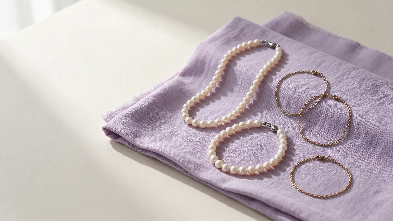
How can a pistachio green pearl bracelet or pistachio pearl bracelet suit your wardrobe and wrist size?
Start with the sleeves you wear most often. A pistachio green pearl bracelet might serve as a quiet accent beside warm ivory, or create a more noticeable contrast against charcoal. Hold the colour beside the garment rather than considering an isolated close-up. Turn your wrist to see whether you enjoy the overall shade or mainly a particular reflection. This makes colour preference a practical wardrobe decision rather than a search for an exact match to a screen.
Next, consider where the bracelet sits during ordinary movements. A pearl bracelet guide can help you compare strand and chain-based layouts before concentrating on green. If you type frequently, notice where the clasp meets the desk; if you wear fitted cuffs, check whether the sleeve passes comfortably over the bracelet. A pleasing colour does not compensate for a fastening that repeatedly catches or a strand that pulls when you bend your wrist.
When comparing a pistachio green pearl bracelet with a pistachio pearl bracelet, how can you assess colour and room for wrist movement?
Compare the shade against a plain, neutral background in gentle daylight and indoor light. Then assess it on the wrist with your arm relaxed, raised and gently turned. Watch whether the strand gathers in one place or the clasp presses beside the wrist bone. Keep the colour observations separate from the movement observations: a change of light and a change of fit answer different questions.
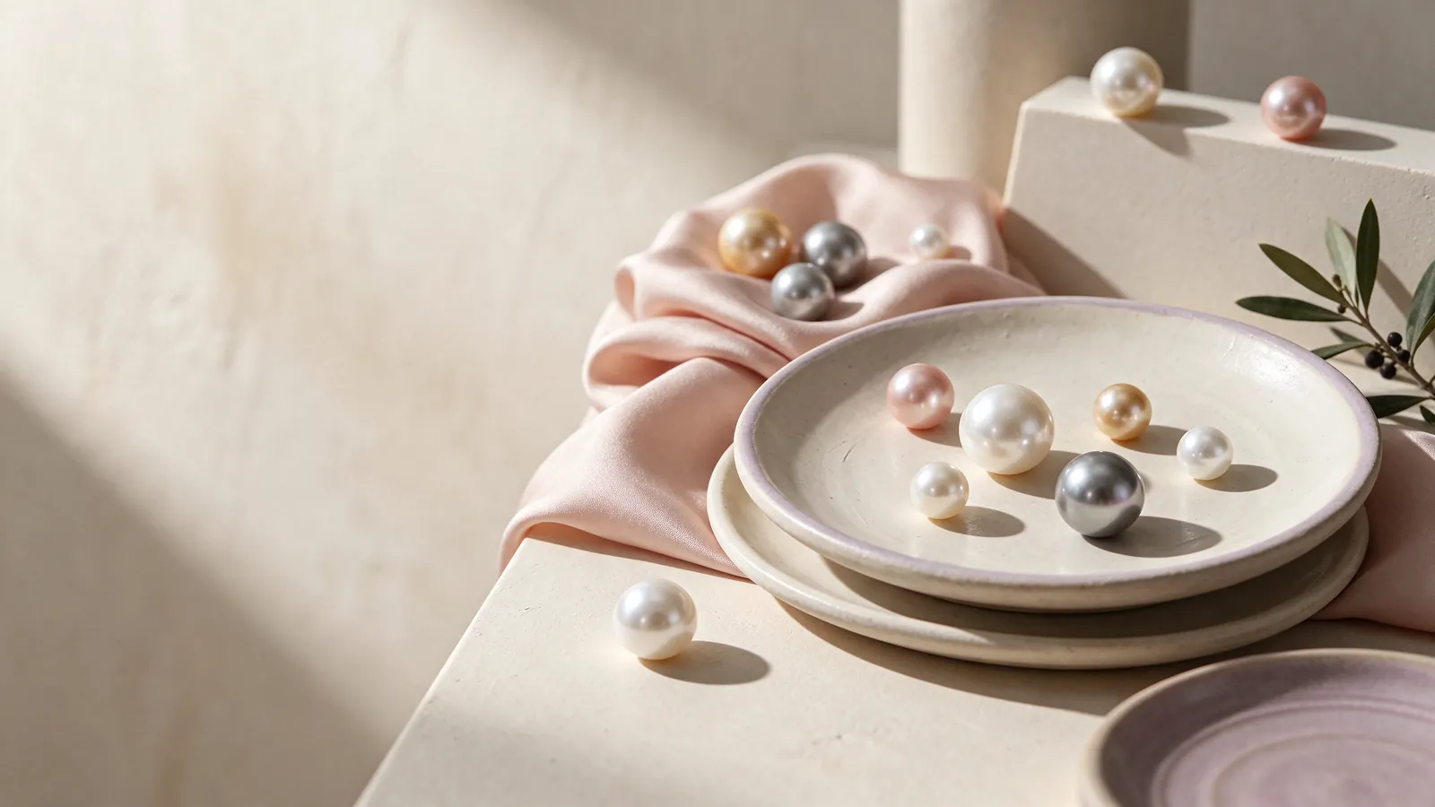
Read the colour description without treating it as a pearl identity
Pistachio and pale green are useful visual descriptions, but they do not define a shared pearl type or origin. A green pearl bracelet label alone cannot establish whether its pearls are natural or cultured, or whether their colour has been treated. Read any identity and treatment information separately from the shade name. If a description only supplies a colour, resist filling the gaps with assumptions based on the appearance of another bracelet.
GIA distinguishes bodycolour, overtone and orient, and notes that not every pearl displays all three. For a bracelet, first consider the predominant colour, then any additional surface colour impression and changes seen as the pearls turn. These questions are more useful than simply asking whether a strand looks green enough. Photography and display settings also affect the impression, so an online image is a styling starting point rather than a fixed colour standard.
Put colour within GIA's seven-factor framework
GIA describes seven pearl value factors: size, shape, colour, lustre, surface quality, nacre quality and matching for multi-pearl jewellery. For a strand, examine whether the visible shape, lustre and colour relationships suit your preference. The framework does not make pistachio a grade, and a photograph cannot settle every factor. It helps you ask better questions instead of letting the colour name carry the entire decision.
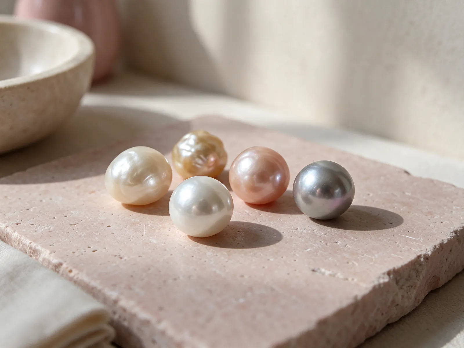
Build a palette around ivory, lavender or a darker cuff
Warm ivory and beige offer a useful starting point when you want a restrained palette. Compare the green against a white pearl bracelet to decide whether you prefer a neutral highlight or a gentle colour accent. Neither option is automatically more formal. Include the whole sleeve in your comparison, because the bracelet's place in an outfit matters more than how attractive it looks alone on a plain display surface.
Pink and lavender can introduce another soft colour, while navy, denim or charcoal can create a stronger separation. Try the bracelet and sleeve first, then add a bag or other accessory one at a time. Patterned fabric, bright nails and several pieces of jewellery may compete for attention. There is no universal skin-tone answer here: comparing your own familiar clothes is more informative than relying on a rule about who should wear green.
Change the emphasis rather than adding more jewellery
For a work outfit, let the cuff and bracelet remain easy to distinguish. For an evening look, you might remove other wrist accessories so that the pearl colour and lustre become the focus. A different sleeve length or handbag can shift the visual balance without adding another bracelet. Decide whether green is an accent or a focal point before building the rest of the combination.
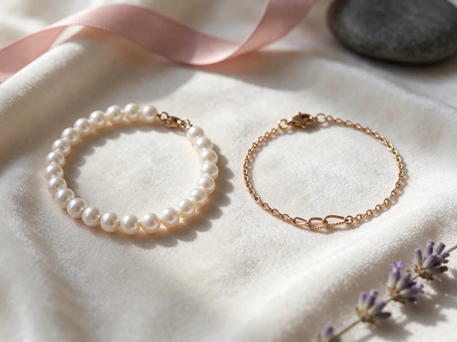
Separate wrist measurement from bracelet length
Measure where you intend to wear the bracelet with a flexible tape resting comfortably against the wrist, without pulling it tight. If you use a paper strip, mark the overlap and measure it flat. Record the position as well as the measurement. Wrist circumference describes your body; bracelet length also involves the strand, fastening and space for movement. Before comparing sizes, establish whether a description means total length, an adjustable range or internal wearing size.
There is no single extra-length allowance that suits every construction. A fuller strand and a fine chain can feel different at the same stated length, while the clasp may change where pressure is felt. Consider whether you prefer the bracelet to remain near the wrist bone or move slightly. Test the sleeves you normally wear and the gestures you make at a desk, rather than judging fit only with your arm held still.
Check the fastening during ordinary movements
Relax your arm, raise it, turn the wrist and gently close your hand. Look for local pulling or a clasp that settles at a troublesome contact point. Do not stretch a strand to test it. Also consider whether you can operate the fastening comfortably yourself. Ease of putting it on is part of practical fit, not a separate detail to discover after choosing the colour.
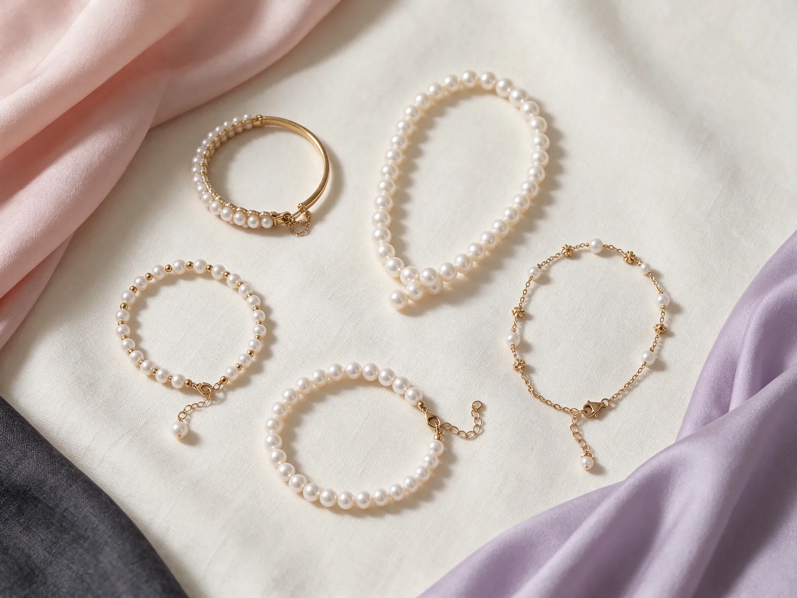
Consider the rhythm of the whole strand
A small pearl bracelet guide offers another way to think about visual weight and sleeve contact. Small is not a fixed diameter here, nor a guarantee of comfort. Look at the bracelet within the whole wrist view and consider pearl spacing and the balance between pearls and metal. A close-up of one appealing pearl may conceal a strand arrangement that feels too prominent or too delicate for your preferred style.
Matching does not have to mean that every pearl appears identical. You might enjoy a soft progression of shades, or prefer a more consistent colour that is straightforward to combine with clothes. Follow the strand from the fastening around its full length. If one pearl appears noticeably darker or brighter, decide whether that variation creates an enjoyable rhythm or a distraction you would notice every time you wear it.
Plan wrist combinations around contact as well as colour
Before placing a watch or another bracelet beside pearls, observe whether the pieces rub as your wrist moves. Wearing them on opposite wrists can preserve a colour combination without direct contact. First assess each piece independently, then consider the pairing. That order makes it easier to identify which fastening or movement causes an awkward collision.
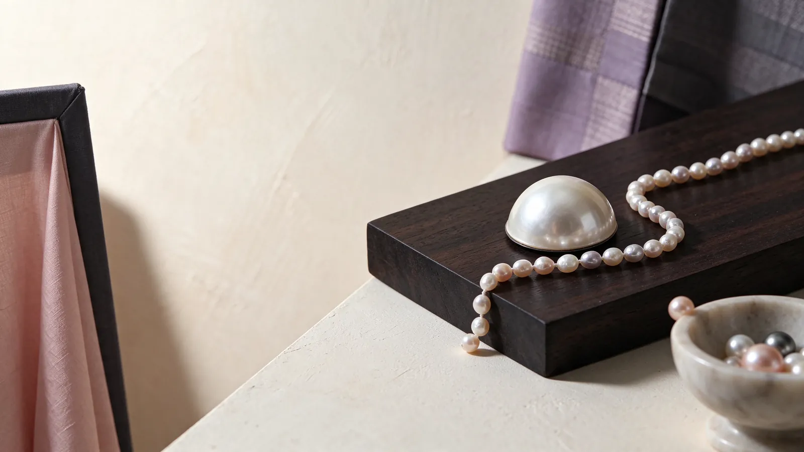
Keep metal appearance and material descriptions separate
Metal framing can change the visual contrast with soft green. Design discussions may consider 18K 750 white gold, 18K 750 yellow gold, 18K 750 rose gold, PT950 platinum or PT900 platinum, without treating the material as evidence of pearl colour or identity. If your search also brings up a sterling silver pearl bracelet, its comparison guide provides a separate material-reading context. Similar-looking metal tones should not be assumed to have the same material description.
Likewise, a 10k gold pearl bracelet is a distinct comparison topic rather than a reason to group all gold-coloured bracelets together. Write down whether you prefer a warmer or cooler visual frame, then read the actual material and fastening descriptions independently. Neither a metal colour nor a material name establishes how a pearl acquired its green appearance, and neither provides a promise that the shade will remain unchanged.
Describe your preferences in usable terms
For a jewellery discussion, bring a photograph of a frequently worn outfit and describe restrained or strong contrast, close or slightly mobile fit, and any need for easy clasp operation. Those details turn a broad colour request into practical priorities. An outfit photograph is a palette reference, not a pearl colour standard; keep the visual preference separate from the written material and pearl descriptions.
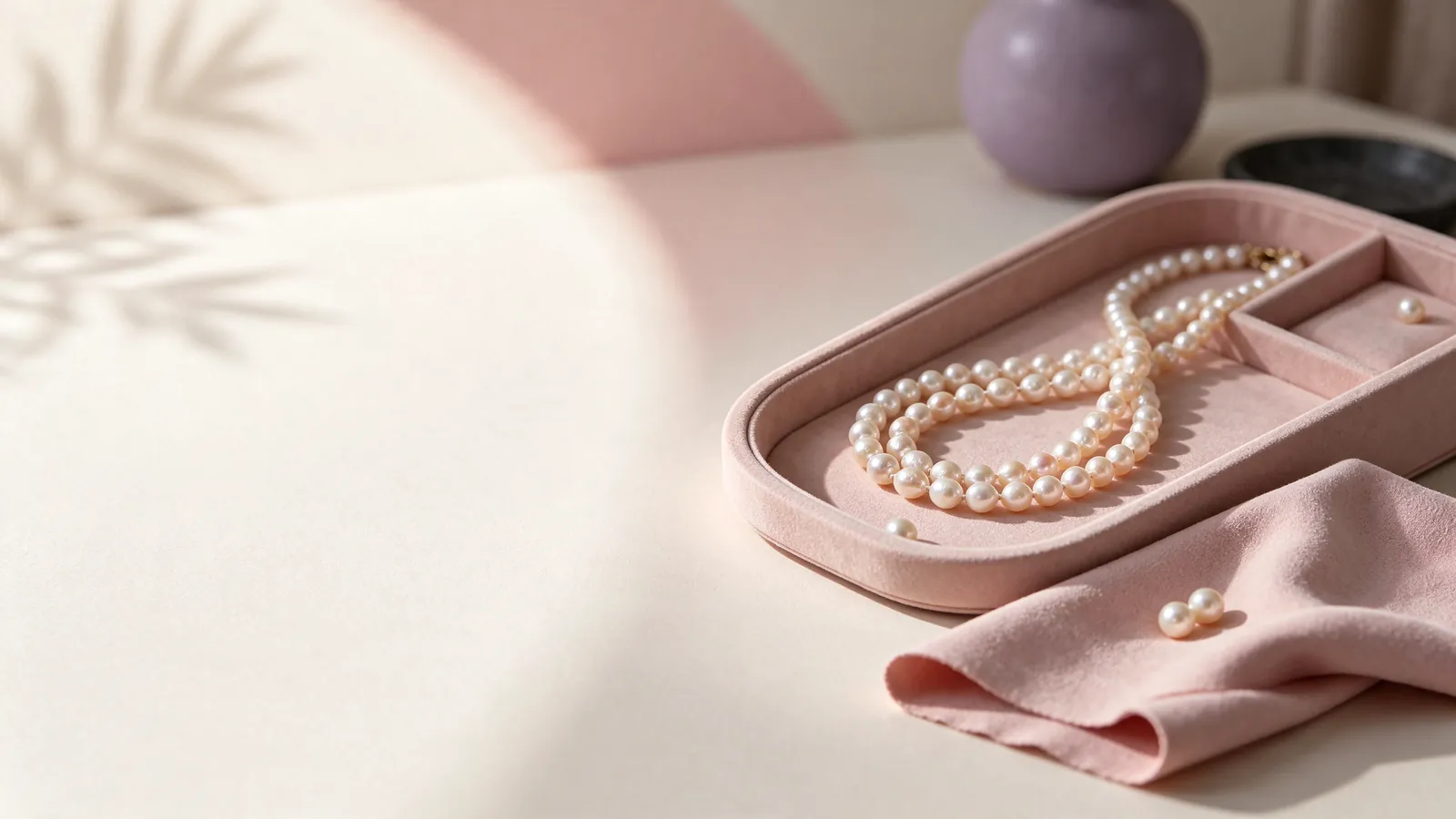
Let care requirements inform the final choice
Pearls worn at the wrist can meet desks, cuffs and neighbouring jewellery. GIA places pearl at 2.5 on the Mohs hardness scale, a useful reminder to avoid abrasion rather than a prediction of service life. Think about your routine: cleaning, exercise and handling objects may be better done with the bracelet removed. A colour you love still needs a wearing pattern that allows sensible care.
GIA advises wiping pearls after wear with a very soft, clean cloth and avoiding acids, perfume, hair spray and excessive heat. Do not use ultrasonic or steam cleaners. If strung pearls are cleaned with water, the string must be completely dry before wearing. Store the bracelet separately from items that could scratch it, and notice changes in the fastening or string instead of overlooking them because the colour remains appealing.
Want to discuss a soft green palette alongside your everyday sleeves and wrist fit? Contact Flint Jewellery on WhatsApp or call +85260106207 to talk through outfit colours, wrist measurements and clasp preferences. Start with the way you like to wear a bracelet, so the conversation reflects your practical priorities.
Make a final comparison with clothes and movement
Return to the outfit, the whole strand and the wrist test. Do you like the shade in everyday light, the relationship between the pearls and the way the clasp behaves? Then read the material, identity and treatment descriptions without extending a photograph into unwritten claims. This keeps the final decision grounded in both personal taste and the bracelet's described characteristics.
| Check | What to observe | Wardrobe or fit decision | Avoid confusing | Useful question |
|---|---|---|---|---|
| Colour impression | Gentle daylight and indoor light | Compare beside a familiar sleeve | A photograph with a fixed colour standard | Do I like the main shade or a reflection? |
| Colour description | Bodycolour, overtone and orient where present | Observe changes as the strand turns | A shade name with identity or treatment | Is pearl identity described separately? |
| Whole-strand quality | GIA's seven pearl value factors | Consider shape, lustre and matching together | Seven factors with a green-colour grade | Is the variation pleasing to me? |
| Wrist movement | Relaxed, raised and gently turned wrist | Check cuff and clasp contact | Wrist circumference with total bracelet length | What does the stated size measure? |
| Care routine | Gentle wiping and separate storage | Avoid rubbing against other wrist pieces | Mohs hardness 2.5 with a lifespan guarantee | Can I remove it before cleaning or exercise? |
Pearl knowledge and authoritative references
GIA describes seven pearl value factors: size, shape, colour, lustre, surface quality, nacre quality and matching for multi-pearl jewellery. Colour is only one part of comparing a soft green strand.
Read the reference for this factFrequently asked questions
Does pistachio describe a specific pearl type?
No. It describes a colour impression, not a shared pearl type, origin, natural or cultured identity, or treatment status. Read those characteristics separately rather than inferring them from the name or a photograph.
How should I compare an online green shade with my wardrobe?
Use the image to shortlist a palette, not to establish an exact colour. Compare the bracelet beside a familiar garment in gentle daylight and indoor light where possible, turning it to distinguish the predominant shade from reflections.
Can soft green work without other green accessories?
Yes. Ivory, beige, grey or a darker cuff can provide a useful starting point. Decide whether green should be a small accent or the main focus, then add other accessories gradually instead of requiring a complete colour match.
Is there a standard amount to add to my wrist measurement?
There is no single allowance for every bracelet construction and preference. Strand thickness, clasp layout and the meaning of the stated size matter. Compare natural wrist movement and sleeve contact rather than automatically converting circumference into total length.
What should I consider before wearing pearls beside a watch?
Check for rubbing and contact with the watch or fastening as your wrist moves. Opposite wrists are another styling option. GIA gives pearl a Mohs hardness of 2.5, so avoiding abrasion is more important than coordinating colours alone.
Updated: